covid19 Germany districts visualization v03.7.0
About this covviz fork
(see below for original 'about' contents)
Most of the code from the fork's repository (https://github.com/jalsti/covviz/) has
originally been written, or is based on code written by Dr. Andreas Krüger, who published it at
https://github.com/covh/covviz/.
It got forked to make some tweaks to the graph plots, starting in September 2020 with a visible x-y–grid
(which needed some changes to the x-/y-scaling/tick amount), faster generating times through using more
than one CPU core, if available, fixing code for some opendatasoft data source changes, making plotting
available with headless systems, and a more flexible district overview plotting setup, with similar setup
for the choice.tml, which has now links for setting more (or less) columns in its overview,
and to which a link gets added on the district plots, showing the plots of the cities in a 50km area around it on one page.
- The plotting of the daily cases got changed, with a new main graph to reflect the sum of the daily cases of the last 7 days for a date in a district, with showing the incidence borders for it.
- A color gradient on the plot backgrounds indicate how large the numbers in it get, compared to other plots of same type. Less colourfull means less relative total cases per people
Still most real work horse code is left in its original form, which is also the reason that all the links which point to the original project are left like they are.
And here now comes the original 'about' content of covviz (with just some minor changes to the own fork URLs, where it makes sense):
Quickstart:
No reading, just clicking? Then start here: Deutschland.html
Study per district ("Kreis", "Landkreis"), the number of reported
infections, in two ways:
- in comparison to other regions, ranked via a variation of the conditional
formatting table of Tomas Pueyo in his Coronavirus: Learning How to Dance --> chart 3
- as a time series plot of observables over time (cumulative
total cases, daily new cases, smoothed with a simple moving average).
All is based on the excellent crowdsourced data by RiskLayer.com,
a research group in Karlsruhe. My instructions how to import that
data - now runs in the browser  !
!
How to access this data visualization:
- download
as ZIP file (35 MB) - advantage: Flipping through the >400
images is really fast, see folder pics/
, OR:
- 1 + 16 pages:
- aggregated into one plot = Germany
OR
- sorted by "expectation day"
- you can also sort the tables by: incidence / prevalence /
reproduction factor /...
- experimental /
: Some recent hotspots with their
neighbours.
Disclaimer:
Everything on this site could just be wrong! Do not base
any decisions on this. Always do your own calculations.
If in doubt, check official sources, for example RKI.de
and BundesGesundheitsMinisterium.de
and WHO.int .
It has been a "quick and dirty" hack ... to put together quite a large
site, in minimal time. There might be errors & bugs.
Please: If you see anything here that raises your suspicion, please do
alert me. Just raise an issue on github. Thanks.
Assumptions and Instructions:
(A1) averaging of the raw data
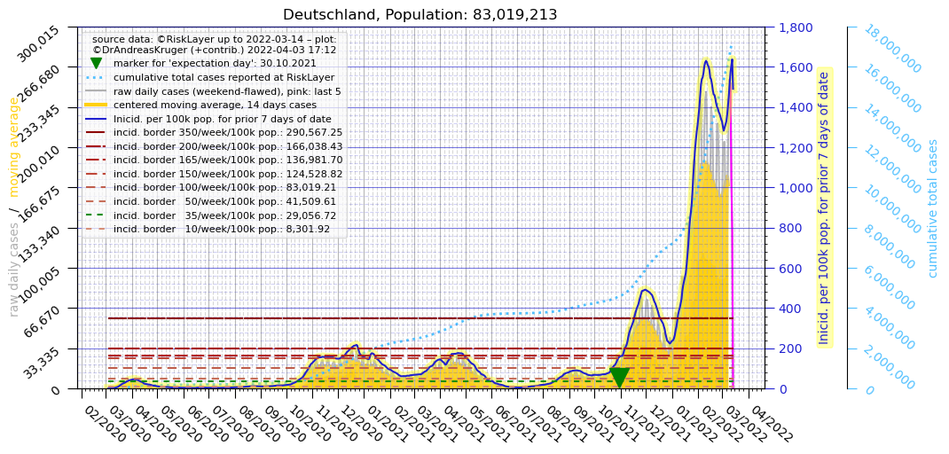
The data quality in Germany has a clear flaw: It fluctuates in a
weekly rhythm (best to see e.g. in the GRAY wavy curve in the Germany
plot) with Thursdays ~twice as many new cases as Sundays. As that mostly
delays the reporting (even though in mild cases it might also lead
to some unreported cases?), the total number of cases x-days-later
will not be (much) affected by that. But the momentary situation "today"
or "yesterday" is quite unclear. One workaround to minimize that
disturbance comes in two steps: (1) averaging of the cumulative total
number of cases over the past 7 days = add up all 7 values, and divide by
7.0, and then (2) shifting that result to the left, by 3 days, because
that is where the "center" of that 7 days average is sitting. For this
step (1) "averaging" there are actually many choices how to do it, see
e.g. this wikipedia page - for now we are choosing a central "simple moving average".
(A1.1) where averages are used
- plots: in most plots you can see that the 7 day average
(purple) is well smoothed already,
no need for a 14 days window (orange).
- tables: the background colors of the table cells: first the
cumulative total cases is smoothed, with 7-days-window, and centered; then
a "synthetic daily new cases" is calculated from that, and used
as the coloring scalar between 0 and the max occurring number in
that row.
(A1.2) where no averages are used
- plots: the GRAY wavy line is the (real, reported, raw, unaveraged)
daily number of new cases
- tables: the numbers themselves, in the colored table cells, are the
(real, reported, raw, unaveraged) total number of cases until that day.
- the following "expectation day", see (A2), is calculated from the
(real, raw, reported, unaveraged) input data of total cases, by taking a
difference of two consecutive total cases, to get the daily_cases(daynumber)
which is the input sequence for:
(A2) sorting by 'expectation day'
(previously: 'center day')
This is used in two places --> The GREEN
triangle in each plot marks that day. And all comparison heatmap
tables are sorted by that 'expectation day' column.
What is it? --> (At least until 2nd waves are happening
...) a good proxy for how relatively dramatic the situation
still is in a certain region, is what we call the "expectation
day" of the daily new cases. The longer ago that expectation day,
the more likely the outbreak is under control now. The expectation
day is calculated like this:
expectationday = sum_over_all_daynumbers [ daynumber * daily_cases(daynumber) ] / total_cases
with
total_cases = sum_over_all_daynumbers [ daily_cases(daynumber) ]
daynumber = 0 is the first day for which we have data (and
incrementing for each later day), and
daily(daynumber) = the number of additional cases per daynumber
(note that for the very first day (the day with daynumber = 0) that is
undefined.)
in other words, the "expectation day" is: the average day,
weighted with the number of new cases for each day = so we get an
"expectation value" for the day = randomly picking any
of the cases, that "expectation day" is a good estimation for the
"when". We had initially called it "center day" but that
caused some confusion. And expected value or expectation
value (google)
is widely used.
(A3) sorting by 'anything'
Now all tables can be SORTED by specific columns, when clicking
the column title text (The large table can take ~30 seconds to be sorted.
Please be patient. The yellow color disappears when the sorting is
finished. Enable Javascript for this work). Now -with this new
sorting option- it makes sense to add more aggregating measures.
Please make suggestions which columns I can try out. Thanks. Some first
idea already included:
- Reff_4_7 = quotient of newest daily cases smoothed, and 4 days
ago daily cases smoothed
- --> effective reproduction number R_eff
estimate. Assumption: One infection generation is 4 days long on
average.
- Same as RKI method described in this article but (4 days smoothing was leading to shaky
results, so) here smoothed over 7 days.
- It can happen that R becomes NaN (not a number) when the days -10 to
-4 had been ZERO, because then the denominator is zero --> i.e. you
cannot really calculate R during the beginning of an outbreak.
- last 14 days new cases total --> absolute number, and "incidence"
= divided by population
- also sort by: population, prevalence (total cases per 1 million
people), Region name, expectation day - see (A2)
(A4) other sites with districts level information
- TU Dortmund AI department in Computer science - a forecast model for
each district (401 out of 401)
- Wikipedia Kreis (district) and KreisSitz (capital city) pages are now
linked where available (294 out of 401)
- risklayer master sheet --> sources --> now added as [1], [2],
[3] below each district plot
You find those as links in the "other sites" section below each "Kreis"
plot. Please tell me about more Covid19 related projects on the Kreis
level. Thanks.
About author, project, funding
- Of course money is appreciated too:
- [BTC] 3Km23oagxEnyt9tJoSyjzns3qGQ6hWSfho
- thank you unknown supporter, the 1st
donation came in on 2020-05-11 08:47
- [ETH] 0x8b70F93D1858C3e06F8703Aa975CB95121519259
[DASH] XfJscL28YdmaX5tmTFrusehAMAYHNYs3qN
- This coin is actually not ProofOfWork, so that it won't use
as much electricity as the above:
[NEM] NCR32VKG5VAYNNJECNWQHI6V4Z6VZOWDLCVJWMKA
-
 CreditCard/Paypal
via my Github sponsors page
CreditCard/Paypal
via my Github sponsors page
- Most importantly, please give it attention = use your social
media influence, retweet, blog about it, share screenshots ... thank you
very much!
- You suggest what else could be added, or report typos, or calculation
errors
I had started looking into Covid19 on January 28th:
Plenty of data, exponential fits, virus information, news articles,
politics, opinion, etc - A good recording of what happened on the
timeline.